Tuesday, October 26, 2010

Circulation

When I think of a home - although this analogy can also be applied to offices, hospitals, restaurants and more - I tend to think of it in terms of a heart. To channel Frank Lloyd Wright for a moment, home is where the heart(h) is; it is a center of life, of activity and creativity as well as rest and rejuvenation. So, much like a heart, to keep it functioning properly, it needs good circulation. Blockages and inappropriate paths can frustrate and cause undue stress; no one wants to live or work in such a structure or space, so it dies metaphorically. Of course, what is appropriate for one client may not be for another so, like many aspects I've discussed thus far, it's important to choose the right circulation for the project at hand.

(Building) Approach
Your destination may lay be a few yards to a mile away; if you have control over that span, then you can control the pathway, or approach, to the building or interior space. In general, this pathway can be straight-on or frontal, to the side or oblique, or you can circle completely around to approach from the other side in a spiral.

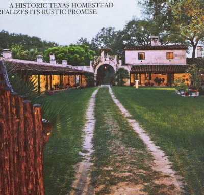
Image credit: Turrentine, Jeff. "Dude Ranch Do-Over." Architectural Digest. June 2006. 206. (Overlay mine)
The approach to the dude ranch above is frontal, through an impressive wooden gate. Visitors are clearly meant to appreciate the spread, and the owners can experience a sense of satisfaction in seeing their home in this way.

(Building) Entrances
The first impression makes the mark when meeting a future employer, friend, or house. For this reason, the entrances are just as important when designing a space as choosing inspirations or color palettes. How they look and where they're placed play a big role in determining if your entrances are effective and relate well to the rest of the project. Entrances can be flush, recessed, or projecting from the building; they can be centralized or off-set; they can take on particular geometric shapes or classical designs to reinforce ideas on the spaces to be seen beyond that entrance. Placing heavy emphasis or (opposite) de-emphasizing can call just as much attention to an entrance.

Image credit: Nevins, Deborah. "Distilling the Cottage." Architectural Digest. June 2006. 224. (Overlay mine.)
 As seen, because there is a kind of structural awning over the entrance, it calls more attention to it. It's a transitional space - visitors are both indoor and outdoor while under this projection - that protects from the weather and subtly recalls kingly canopies.

Configuration of the Path
This is, or can be, very similar to spatial relationships - which it should be, considering how these concepts dovetail together. Paths can be linear, spiral, radial, grid, network, or composite.

Remember the Hugh Newell Jacobsen structure in my last post? Here we see what a close relationship the configuration of a pathway can share with spatial organization. Its grid layout also ensures a grid pathway. The relationship won't always be this close, but it won't be terribly far off, either. For example, a clustered organization could lead to a network pathway configuration.


Path-Space Relationships
This concept differs from the above in that we consider how the path is relating to spaces very generally. As such, the path can pass by spaces, pass through a space, or terminate in a space.

Image credit: O'Keeffe, Linda and Ellen Johnson. "Hall in the Family." Metropolitan Home. April 2006. 116. (Overlay mine)
The pathway above passes by most of the spaces, and then terminates (mostly) in the den. The effect is of a rather large hallway, which was the focus of the article. The spaces off to either side have reduced traffic and help maintain a semblance of privacy for their occupants, while the hallway psychologically enlarges the place overall (one might think a long hallway means a big residence or building).

Form of the Circulation Space
We take our pathways for granted; we don't always think of how our pathways are built. But they, too, need consideration. They can be entirely enclosed, open on one side, or open on both sides. (I would argue that a bridge is almost entirely open; while there may be railings on both sides, their construction is such that you can typically reach over or through those planes, and unless it is a covered bridge, there is typically no overhead enclosure either.)

Image credit: Thurman, Judith. "Juan Pablo Molyneaux." Architectural Digest. September 2006. 186. (Overlay mine.)
A typical hallway, like the one above, is enclosed on all sides. Colonnades are examples of the other types, depending on whether or not they are situated next to another plane (wall). In a situation where there is a space within a space (such as a walled courtyard), the pathway's form would be open to one side when skirting the inner space. It could be a similar situation for a stairwell, also a space within a space, though the argument could be made that it is enclosed, instead. Regardless, the forms these pathways can take depend on various needs, such as air and traffic flow, or a need for openness or enclosure, more light or less, and where the pathways lead and terminate.

Tuesday, October 19, 2010

Spatial Relationships and Organizations.

Now that we have defined our spaces, we can look at how they relate to each other and how they're organized. Doing this not only keeps them interesting, but makes them cohesive and relate to whatever central guiding principle we're working with for any given project. For example, an ultra-modern house for a family that needs a high degree of organization to keep it clutter-free will not work well if each space is too cut off from the central space, or arranged haphazardly with no relation to each other. Family members would feel justified in keeping their areas less clean and neat because "it won't be seen" from the main public area.

Spatial Relationships
The concept of "spatial relationships" is fairly self-evident, however, looking at examples can clarify what it entails, for it really is a visual construct and understanding. It's rather important, in fact, because although it can be applied broadly, it can also be applied on smaller scales to maintain aesthetically pleasing arrangements in your home or ensure that each piece will fit appropriately in a given space.


These relationships include: space within a space; interlocking spaces; adjacent spaces; and spaces linked by a common space. Examples include atriums and courtyards (for spaces within a space), or kitchens and dining rooms that follow immediately from living rooms (for spaces linked by a common space).

Image credit: Drucker, Stephen. "Connecticut Crossover." Architectural Digest. June 2004. 196. (Overlay mine.)

 The above is an example of space within a space - the squared-off area surrounds a stairwell leading downstairs, but also has purpose of its own as storage and display.

Image credit: Newhouse, Victoria. "In Accord With the Landscape." Architecture by Zvi Hecker. Architectural Digest. September 2006. 110. (Overlay mine.)
In the plans above, there are many examples of interlocking spaces, of which I have picked out a few. Note that this can be achieved many ways, some of which can be seen above and some that can not.

Spatial Organizations
 Additionally, spaces can be organized -- as groupings of spaces, or as groupings or arrangements of furniture or other defining elements within a space. Again, this should adhere to the aesthetics and guidelines you desire for your spaces. If you are designing for an eclectic, bohemian and kitschy client, it's helpful to have an organization scheme that also reflects these sensibilities - something clustered would work better than arrangements in a grid or linear manner.

The organization schemes we commonly work with are centralized; linear; radial; clustered; and grid. Occasionally an organization scheme could incorporate more than one type, such as linear and radial. As long as it fits with the client's needs, is aesthetically pleasing and relates to the central concept, it doesn't matter.

Image credit: Aronson, Steven. "Distilling the Cottage." Architectural Digest. June 2006. 228. (Overlay mine.)
 Here we see clustered organization, which is similar to centralizing in that the spaces or objects surround a central space or object. Where it differs is in how they may be arrayed around the central axis, differences in size, shape or form of the surrounding objects, and so on; the only organizing principle is the centrally-located object.

Image credit: Bissell, Therese. "State of the Art." The Mary Howard and Lester Wing (by Hugh Newell Jacobsen), University of Oklahoma. Architectural Digest. Sept 2006. 164. (Overlay mine.)
Hugh Newell Jacobsen's plan for the new wing of the University of Oklahoma shows a very straightforward grid organization of the spaces, which relate to each other via hallways and stairs, as well as gallery spaces. It also features examples of interlocking, adjacent, and space within a space relationships.

Image credit: Schmertz, Mildred. "Gavin Macrae-Gibson." Architectural Digest. Sept 2006. 264. (Overlay mine.)
Linear organization doesn't always follow a straight line as seen above; it can also follow curved, jagged, u-shaped, or other kinds of lines. At its essence, spaces or objects are arranged in a linear fashion to promote a certain continuity or flow. In the example above, the bed leads to the breakfast nook which leads to the lounge chairs outside in a logically progressing manner.

Speaking of continuity and flow, my next posting will address circulation, another important consideration of your interior spaces!

Thursday, October 14, 2010

The intermarriage of Form and Space

Now that we understand Form, we can see how it can affect Space. Space is defined by form(s), in fact; we think of it as empty, so the idea of defining it is impossible without involving form. This is what I'd call a dichotomy of design, but is more formally called the unity of opposites. These two opposite concepts are necessarily united in the building arts - designing a building isn't just about the structure, it's also about the spaces inside it. In a house, for example, the spaces are 'kitchen', 'bedroom', 'bathroom', 'studio', and so on.


Image credit: Kohl Children's Museum by Booth Hansen, Metropolitan Home, April 2006, 44. (Overlay mine. The overhang of the building is a form creating space.)

But how do we define those spaces? In many, many ways, all involving the use of planes and openings within them.

We can define space with horizontal elements, and typically this involves the base (or ground) plane, elevated plane(s), depressed plane(s), and overhead plane. Translated, this means ceilings, floors, and any horizontals in between. A sunken living room floor would be an example of a depressed plane.

Image credit: Barreneche, Raul. "Park Avenue Petite." Metropolitan Home. March 2009. 92. (Overlay mine.)
 In the above images, the circular element subtracted from the overhead plane defines a space within the hallway that encompasses the table and flowers below it.

Space can be defined by vertical elements, as well, and may be the easier concept to understand since it typically involves walls -- we tend to think of space as areas defined around us, not above or below although they are included. As such, there are many more ways that a space can be defined: vertical linear elements, single vertical plane, L-shaped plane, parallel planes, U-shaped plane, and four planes: closure.

Image credit: Philip Johnson's 1949 Glass House. Architectural Digest. May 2006. 68. (Overlay mine.)
The above images show what can be done with vertical linear elements, better known as columns or posts. These can also be seen in Le Corbusier's modern works like the Dom-ino Skeleton, or from antiquity like the columns of Greek, Roman, or Egyptian temples, for example.

This and the next images also show examples of openings that define the space -- usually meaning windows, but can broadly be any opening within (or instead of) a plane. Openings occur in various positions within planes, at corners, and between planes.

Image credit: Nobel, Philip. "A House for Art's Sake." Architectural Digest. May 2006. 242. (Overlay mine.)

These openings above are window walls, which occur between planes. When the edges of the window/opening go from planar edge to planar edge (involving 3 our of the 4 possible), an opening is between planes. Any smaller, and it would fall under one of the other categories. This configuration tends to let in the most light, although a few of the corner opening configurations may be equal.

This leads to the last point: light is a quality of architectural space, as is color, texture, scale, form, and so on.


Light can come from different sources, but it is typically natural or artificial. "Natural" includes sunlight and candlelight, while artificial comes from anything man-made (lampposts, flashlights, lanterns, lightbulbs, etc.). In the image above, light comes from both sources: the ribbon windows echo the showcase of cars along the edge of the room, while the overhead lighting spotlights the car underneath, evidently a prized possession.

Next posting will include the organization of space, and spatial relationships.

Thursday, October 7, 2010

Playing with blocks. (part 5)

Sometimes interior design and architecture is a puzzle. You're given certain pieces - usually requirements from the client, maybe some measurements of the space to work with - and you need to provide a solution to the problem (puzzle) you're given. Within the context of blocks (working with forms), we can look at it like a tangram puzzle. In the client's case there may not be just one right answer, but it's our job to figure those answers out and provide the best fit.

Sometimes even using the previously- mentioned tools (dimensional transformations, subtractive forms, additive forms) isn't quite enough to provide that best fit. We have one last tool in the box: formal collisions of geometry. The name itself is pretty suggestive of what it is, but to clarify, it is using at least two forms (as they are, or rotated) and combining them together so that they become a new form. (Remember the movie The Fly with Jeff Goldblum? That was a formal collision, indeed.) Any forms can be used, and a look at a wide variety of floor plans will show that it's used quite a lot when a certain effect is desired, or the space one is working with is challenging.

There are formal types of these collisions: circle and square, rotated grid, and articulation of form. The last refers to a form with surface definition such that it particularly defines or suggests the form. Think of scales, or plates of armor, for example. Pattern and texture can achieve this as well. Here, however, I would like to address edges and corners; no matter what sort of forms you end up using, you will need to address your edges and corners and how they define your space. To make it perfectly clear, edges are the exterior outline(s) of a form or plan, and corners occur in the interior of a space where two planes meet (literally or figuratively).


Both edges and corners are important, but when considering interior design, how you address corners in particular is important for defining (or not) the space. The key is that the angle between your planes - the corner - must be such that the corner does not simply resemble a wall. In other words, an extremely large angle won't feel like a corner. Most corners are formed with right angles (90 degrees), but as a general rule of thumb, one could realistically work with angles anywhere from 60 to 120 degrees. (Cases could be made for smaller or wider angles than these, but it would take a truly talented designer to do so.)

Angle alone isn't the only concern - what shape could the corner take? Any, really, and sometimes there isn't anything there at all. Sometimes a lack of definition provides definition by its very absence. The corner can fold inward or jut outward, can be smooth or highly articulated, and so on. Consistency is key.

Wednesday, October 6, 2010

Playing with blocks. (part 4)

Blocks inspire a simple desire to build and create. How we do this can take on any number of strategies, but the most instinctual is simply to stack and group blocks together. In architecture and interior design, the resulting structures and spaces are additive forms - forms created when pieces or other forms are added to a base, original form. Additive forms can be accomplished in many ways, but for this post I will be focusing upon one.

Clustered forms are arguably the most common additive forms. Primary solids are grouped, attached, or overlapping each other to some degree to create one complete structure. Typically, no one form is dominant over the others, as in the centralized form. Some examples of these can be seen in modern interpretations of English Gothic Revival houses, or some Victorian Queen Anne or Stick Style houses. These clustered forms most truly resemble the little structures we assemble with blocks in our youth.

Image credit: Tamco Building Products, Inc. Advertisement, Lamarite slate. Architectural Digest. May 2007. 193.
The above images underscore the "building block" aesthetic I spoke of - here is a chunky triangular pediment piece, here is a cube, there is a cone. Clustered forms don't have to have this charming, haphazard structure, but it is one of the easiest to achieve. Taken to the interior, a clustered form could create what I would call a "layered" space, and as long as the concept is strong, designing for such an interior would be as interesting a task as the result would be for the client: visually appealing, blending in with the rest of the space almost unobtrusively, and always exciting.

Playing with blocks. (part 3)

There's a certain adult version of playing with blocks -- the tower of crisscrossed squared block pieces that you must carefully remove from lower sections of the tower and equally carefully place on top of the tower, the aim being to build as high as possible with the tower's own parts before it falls over. We can do the same in architecture and interior design, only it's not a game and you definitely don't want it falling over! An essential component is just the same, however: doing something unexpected with what you thought was solid and unchangeable.


The idea is just as simple as the game: removing parts from the original form to create a new form. The new form may still resemble the original, but it may also look completely different. These are subtractive forms, and can surprisingly be found in many places you look.


Image credit: Bissell, Therese. "A Not-So-Simple Plan." Architectural Digest. November 2006. 194. (Overlay mine.)

This can be done in different ways, and more than once, depending on the concept at hand. Modernist houses like the one above have more than one subtractive form to be found. For example, the second floor seems to have a subtractive quality, as does the fireplace downstairs. This maintains a clean-lined aesthetic without it appearing static and uninteresting. Subtractive forms may also serve a purpose, mainly in delineating special spaces. Some resort hotels or vacation homes subtract in order to integrate with what's outside, such as a pool. That space then serves a transitional purpose, allowing users to seamlessly move from indoor to outdoor with no thought or effort.

Playing with blocks. (part 2)

While primary solids on their own are useful building tools in creating space and organization, they don't have to be used unaltered. In this post and the next few posts, I'll discuss ways to change and adapt them for more interesting uses.

Imagine those building blocks from childhood, again. While those blocks included some pieces that were not strictly primary solids (such as the arches and half-circles), most of the time the basic set sometimes proved frustrating in that they didn't always provide enough desired forms to build what was in our minds' eye. However, if we could have stretched, pushed down, or trimmed pieces from them, we would have gotten precisely what we needed.


In design, this is called dimensional transformation. In more formal terms, one is altering one or more of a form's dimensions, such as height or length, in a way that still leaves it recognizable as the original primary solid. As mentioned before, this is a useful tool in space planning, furniture selection, lighting, and many other areas of interior design. One could use this either to adapt a challenging floor plan, create something new and innovative, or simply add unexpected interest. A particular form could be suitable in general (such as a cube for a chair), but dimensionally transformed it becomes better, and tie in with a concept more appropriately.

Image credit: O'Keeffe, Linda. "Rooms to Grow." Metropolitan Home. April 2007. 123. (Overlay mine.)

In the pictures above, a cylindrical form was put into this space. It could have remained small and served as an endtable, but squashed and up-sized, it becomes an ottoman, coffee table, and even additional seating. It also provides some interest in what could have remained a room with mostly sharp angles, lending it some soft edges.

Playing with blocks. (part 1)

When I was in kindergarten, one of the most popular toys was an enormous pile of blocks. These didn't just include the alphabet cubes, but a whole range of blocks with different architectural shapes. Miniature child-wrought architectural wonders were created until accidentally (or purposefully) knocked down. Some of us never really outgrew that, because in architecture and interior design you must play with these forms, in essence, to create the structures and spaces clients desire.


The basic building blocks are called primary solids. They are forms that arise from primary shapes, discussed in my previous posts. Triangles become cones or pyramids. Squares become cubes. Circles become spheres or cylinders.

Use of primary solids isn't confined to creating spaces; they can be found in elements of an interior, such as furniture and lighting. They can enhance the utility or aesthetic of such pieces.


Image credit: Bernstein, Fred. "Naturally Perfect." Metropolitan Home. April 2007. 107 (Overlay mine.)

In the above images, using a conical form for the pendant lights enhances both their aesthetic and utility - the light generated will overlap and spread outward over a greater area, concentrating the light in that part of the room.