If there's one thing I'm growing to love more as I learn more about the state of American economy, our world (and American) ecology, and innovations in design overall, it's seeing the drive to make our living footprints smaller and smaller. Learning to live more fully with less is imperative if all of us are to lead healthier lives in every possible aspect from the personal to the global - mind, body, and soul. With new designs emerging constantly showing us precisely how we can do this, the excuses not to do so are shrinking. One day, it will be affordable for everyone. Call it a design revolution.
One of the leaders of this revolution is Graham Hill, founder of the website Treehugger. (See my list of links in the sidebar.) Back in October (I'm only now finding out about this, or I would have posted it sooner) he launched a design challenge: turn a 420 sq.ft. New York apartment into "a jewel box" with "an ultra-low footprint." You can find more details at LifeEdited.
Anyone following this blog knows that my classmates and I faced a similar challenge with our smaller list of requirements for our Living Cube project, so it's plain to see why the LifeEdited challenge would interest me. It's a larger space, incorporating a kitchen and bathroom, so theoretically it would be easier to do. I'm also familiar with the space-saving options listed at Resource Furniture, having utilized the Doc bunk bed for my particular cube. However, the larger list of requirements and the larger space also make the challenge more difficult -- and more fun!
Photos of the space to be renovated can be found at Graham Hill's Flickr set 150 Sullivan. It really is a small apartment -- in Soho, from the looks of it -- but the neighborhood looks charming. When it's all done, who wouldn't want to live there? (I also have to say that it reminds me of a Counting Crows song, "Sullivan Street.") Keep your eye on the submissions; they're all pretty amazing! The deadline also happens to be my birthday, which makes me peculiarly motivated to make the attempt, despite not knowing anything about super-insulating or how to offset (or not) existing gas radiators.
If you're working on this design challenge, I'd love to hear from you!
Saturday, December 4, 2010
Friday, November 19, 2010
Promotion
I'm not sure if my other classmates from Form, Space and Order at SCAD will use these blogs beyond the classroom requirement, but as I've said before, I will. I started using the Internet in its early stages with message boards, online discussion groups, MUSHs and the like, and kept using as it has changed and grown, so this is a very comfortable medium for me. For all that most folks seem to be into social media, they're not really into using the Internet as tools beyond that, but I sincerely hope they do: it's invaluable in this day and age.
To begin with, I'd like to start promoting my work. It's very much student work at this point, which I'm sure anyone reading this (and not just my classmates) understands, but I felt it was important to reiterate that. I hope, then, that people will be able to see how I am growing and changing as an...well, I suppose "artist" applies (although that's a loaded term to me, which I will explain at some point), considering what I have done until recently, but as an interior designer as well.
I fairly regularly post the work I'm proud of or simply want to share on Flickr:
http://www.flickr.com/photos/hulda_art
I'm most proud of my floor plans and Rendering pieces (of the work I've done most recently), and work like these:
 | ||
| "now i lay me down to sleep" - from Photography class |
Wednesday, November 17, 2010
Final destination?
As I've mentioned before, being in Form, Space and Order at SCAD has been a journey. For me it's been a rather bumpy one, but in my experience those are the journeys that teach you something. (And despite hearing others not in the class talk about 'time management,' that's not what this has taught. I had that already.) I'm still sorting out the lessons -- since the quarter officially ends tomorrow, for me, I'm still too close to it to assess with clarity -- but I did have an insight toward the end that has helped me put things into perspective.
My particular challenge in this course were many rounds of drafting and refining. Quite honestly, I find it tedious. However, it is a good opportunity to figure out how to do things differently so that your creation becomes that much better. I've had experience with that in writing, particularly freelance work. You're usually playing with someone else's world, someone else's creation, so if something has to change then you've got to roll with it. You can't afford to be married to your ideas because of that; you have to develop a thicker skin. You've also got to revise and edit as you're asked. That means refining your work, doing multiple drafts, and, as the writers say, kill your darlings.
So how did it all start? With our design philosophies, which I've detailed already. Those words and pictures became the basis for diagrams that would become our final parti drawing.

From there, we created Form and Space models from our parti diagrams. I preferred the outcome of my Form model, which served as the focus for my typology studies and inspiration further on in the project.


Then we were asked to make the leap from concept to functionality. It was a pretty big leap, so naturally folks had to go through a few critiques. I went through a lot of critiques. I think the end result, however, turned out well.


So what does this look like three dimensionally? Take a look.
I have my own opinions as to how it all turned out; there are parts I'm really displeased with (not due to design, but craftsmanship), and other parts of the cube that I'm coming to like very well.I know I wouldn't have designed it this way if I'd known we were doing this from the beginning. It was certainly long and exhausting to work as intensely as I did toward the end. Friends and family have seen a picture as well by now, and all of them are various shades of impressed. If that is where I set my standard --and I do, in a way, considering they're also future clients -- then I'm pleased, too.
What I take from this class is a need for flexibility, patience, and perseverance. It also needs designers to remember those concepts taught in their first design class, the elements and principles of design. All else builds upon that. It's the foundation for everything else.
My particular challenge in this course were many rounds of drafting and refining. Quite honestly, I find it tedious. However, it is a good opportunity to figure out how to do things differently so that your creation becomes that much better. I've had experience with that in writing, particularly freelance work. You're usually playing with someone else's world, someone else's creation, so if something has to change then you've got to roll with it. You can't afford to be married to your ideas because of that; you have to develop a thicker skin. You've also got to revise and edit as you're asked. That means refining your work, doing multiple drafts, and, as the writers say, kill your darlings.
So how did it all start? With our design philosophies, which I've detailed already. Those words and pictures became the basis for diagrams that would become our final parti drawing.

 | |||||||||||||||
| The upper left mini typology pic has the final parti; the right shows the first version. |


Then we were asked to make the leap from concept to functionality. It was a pretty big leap, so naturally folks had to go through a few critiques. I went through a lot of critiques. I think the end result, however, turned out well.


So what does this look like three dimensionally? Take a look.
 |
| My barn door! |
 |
| The sofa/bed. (It converts.) |
 |
| Finished! From concept to reality. |
What I take from this class is a need for flexibility, patience, and perseverance. It also needs designers to remember those concepts taught in their first design class, the elements and principles of design. All else builds upon that. It's the foundation for everything else.
Sunday, November 14, 2010
Final thoughts: a preview.
I have many thoughts about Form, Space and Order in general and my capstone project -- a living cube -- in particular. We joke about it a lot because it gets said a lot, but both really have been a journey. This echoes everything about life and learning, actually: it's always a work in progress. For class purposes we'll call the project "done" when we turn it in at the end of the quarter, but the lessons learned will hopefully stay with me (and the rest of us) in future classes, projects, and perhaps even our actual practice outside of SCAD.
In reality, however, we're never really done. We just move to another phase, another cycle, another round of ideas and discovery, putting them into practice, and refining as we go. But to really move forward? That takes some thinking outside of the box.
In reality, however, we're never really done. We just move to another phase, another cycle, another round of ideas and discovery, putting them into practice, and refining as we go. But to really move forward? That takes some thinking outside of the box.
 |
| Cardboard study model for Living Cube capstone project. |
Wednesday, November 10, 2010
It's the principle of the thing.
I wrap up the terminology blog posts with this: ordering principles. These principles guide designs and make sense out of chaos, like a roadmap: you could design anything you like any way that you like, but it won't turn out well if there isn't a guiding concept to rally behind.
An axis, for example, is a line (visible or implied) that divides symmetrically or in a balanced fashion. Put another way, it's the central point or line around which everything collects, gathers, organizes or rotates.

Above, we can see an axis going through the middle of the Capitol Building, and all other elements arranged around it very symmetrically.
Symmetry then, to follow up, is a balanced arrangement around a central point or axis. This definition tends to go hand-in-hand with an axis, but a building or space could have more than one axis and with no symmetry, whereas symmetry demands an axis to revolve around.

A pyramid is one of the most basic symmetrical forms; if cut down the middle, each side would mirror the other.
But perhaps your arrangement will have asymmetrical balance, instead. One way to achieve this is through hierarchy, heightening the importance or distinguishment of a form or space through increased scale, articulation, shape, or other design principle.

London's Parliament building shows hierarchy through two larger-scaled buildings attached to or associated with it, like Big Ben, while the majority of the structure follows the same pattern and shape.
Rhythm is a recurring pattern or motif - it repeats or alternates in some manner, such as through color, shape, or positioning.

 In the room above designed by Dorothy Draper, we can see that not only do the floor tiles show rhythm, but the repetition of colors or placement of chairs do as well.
Often we see datum organizing our designs, a line, plane or volume to which other elements relate. An axis line would be a pertinent example.

The layers of the Colosseum serve as the datum under which the arches gather, organizing them so that they appear in this orderly fashion.
Lastly, the practice of transformation can be a very helpful design too. Transformation takes a design and makes changes such that it still retains its original identity afterward. We can see this when comparing Bramante's and Raphael's plans for St. Peter's Basilica in Rome.

 Notice the elongation of the basic basilica plan in Raphael's version versus Bramante's more centralized and compact composition below.

An axis, for example, is a line (visible or implied) that divides symmetrically or in a balanced fashion. Put another way, it's the central point or line around which everything collects, gathers, organizes or rotates.

 |
| Picture taken from Wikimedia Commons. |
Symmetry then, to follow up, is a balanced arrangement around a central point or axis. This definition tends to go hand-in-hand with an axis, but a building or space could have more than one axis and with no symmetry, whereas symmetry demands an axis to revolve around.

 |
| Images Copyrighted by Historylink101.com & found at Egyptian Picture Gallery. |
But perhaps your arrangement will have asymmetrical balance, instead. One way to achieve this is through hierarchy, heightening the importance or distinguishment of a form or space through increased scale, articulation, shape, or other design principle.

 |
| Taken from Wikimedia Commons. |
Rhythm is a recurring pattern or motif - it repeats or alternates in some manner, such as through color, shape, or positioning.

 |
| Image credit: Architectural Digest. http://www.architecturaldigest.com/resources/notebook/2008/06/oscar_slideshow |
Often we see datum organizing our designs, a line, plane or volume to which other elements relate. An axis line would be a pertinent example.

 |
| Taken from Wikimedia Commons. |
Lastly, the practice of transformation can be a very helpful design too. Transformation takes a design and makes changes such that it still retains its original identity afterward. We can see this when comparing Bramante's and Raphael's plans for St. Peter's Basilica in Rome.

| Taken from Wikimedia Commons. |
Wednesday, November 3, 2010
A proportional response.
We often underestimate just how much of an influence the Greeks had on the world, Western society and maths more than anything else. The idea of democracy contributed to the establishment of the United States government, for example. Science and mathematics contributed the most to our sense of fundamentals, however. Pythagoras's theorem is a fundamental of trigonometry and geometry. These in turn are the foundation of proportion and scale, which are also necessary elements of interior design just as they are for architecture.
There are many kinds of proportion used for architecture and interior design: material proportions, structural proportions, manufactured proportions, all used to define where and how certain elements can be placed to create a functional and safe building or space. We take this one step further, however, and shuffle these elements to also create something aesthetically pleasing. To do that, we take a closer look at scale and proportioning systems or theories.
The Golden Section comes from Pythagoras himself, and was used to build most of the ancient Greek monuments and temples. It's a mathematical concept, a progressive geometric expression, that starts with a rectangle. If cut into a square on its shorter size, the smaller rectangle left over will have the same shape as the original, but scaled smaller. When this is continued (whether cut into smaller and smaller squares, or added to in a reverse process), the lines created when beginning from the corner of the smallest shape will spiral out like a nautilus shell.


This basic idea can be carried through into interior design in very simple ways, like the windows above that carry over into the cabinetry. It creates a sense of connection or context with the rest of the space. In fact, that is a key concept to keep in mind regarding proportion and scale: their properties rely on a relationship with other elements. One gets a sense of scale or proportion only when compared with surroundings.
Similarly, the Classical Orders are another proportioning system the Greeks and Romans gave us, architecturally. They are based upon the dimensions of a column's diameter; since the five different types of columns each tended to have its own dimensions, each gave its name to an order. Therefore we have the Tuscan (Roman), Doric (Greek), Ionic (Greek, Corinthian (Greek), and Composite (Roman) columns and capitals that lend their dimensions to the buildings in which they are integrated (hence intercolumniation).

The skylight seen above has a Greek temple front on its exterior, and so its interior follows its lines nearly exactly. The lines don't follow directly below it, but the space below is still proportional to it.
Then during the Renaissance, Andrea Palladio applied Greek concepts to determine optimal ratios for architecture (Renaissance Theories). This gave rise to the seven ideal plan shapes for rooms: circle, square, 1: (square root) 2, 3:4, 2:3, and 1:2.

The proportions seen in Charles Allem's apartment here follow the 2:3 ratio or proportional system.
Then Modernists caught revolutionary fever from many of the artists and politics of their time, and wanted to promote forward-thinking and not be tied to the past. The results were not always successful; Le Corbusier developed his own proportioning system that could not entirely divorce itself from the Golden Section. He did, however, reconcile it (for the most part) with human scale: his Modular is based upon a six-foot tall man, with base units coming from how he sits, bends or stands such that it follows the Golden Section. Three main measurements are used and repeated (in centimeters): 113, 183 and 226.

While its aims were to be applied universally (much like the International Style Le Corbusier attempted to design), it did not see as much popularity as the more classic proportioning systems. The above pictures are another way to reconcile the same concepts (human scale and the Golden Section); they appear similar to, but are likely different from, the Modular.
Western proportioning systems are not the only ones out there, however. In Japan, there is a system revolving basically around the proportions of the tatami mat, which was intended to either seat two people or let one person sleep on it. This system is called the Ken, and tends to look very grid-like when laid out (though occasionally linear or staggered, depending on the orientation of the mat units). Each room is built according to how many mats it can or will accommodate: 3-mat, 4-mat, 6-mat, and so on.

Frank Lloyd Wright, who was inspired by the Ho-o-den of the first Chicago World's Exposition, is likely to have known about the Ken. The windows above come from one of the houses he designed in Chicago.
As design progresses, we become more and more concerned about it being as accessible as possible. Interior design is particularly concerned with human needs, so it follows that human scale and proportion governs how we design spaces for our clients. This means we must be educated in the study of anthropometrics, which are human measurements. We generally design for the human average, but sometimes need to deviate due to different measurements thanks to age, ethnicity/race, or other genetic factors. By extension we must also be mindful of divisions of public, social, and personal space (proxemics) in our interiors, or we inadvertently create spaces too large or small for our clients' comfort.

Here we see the designer (who is also the client) in relation to the sofa in her living room.
Most fundamentally, we must be concerned with scale, which helps determine our proportions. Scale refers to size, and tends to be fixed. Francis Ching defines it as "a fixed proportion used in determining measurements and dimensions" (Architecture: Form, Space and Order, p 301). We can get a visual sense of how large or small something is when it is in relation to another object, such as a figure standing next to a building. We can also manipulate that sense of scale by increasing or decreasing elements such as patterns within an object or space: a busy pattern on the walls of a room could make the room seem smaller than it is.

Louis Kahn was very conscientious regarding proportion and scale and knew how to manipulate them to great effect. In the above picture, if we had no piano or other item to give us an idea of its scale, we might be tempted to believe that the central building is smaller than it really is due to the towering structures surrounding it.
There are many kinds of proportion used for architecture and interior design: material proportions, structural proportions, manufactured proportions, all used to define where and how certain elements can be placed to create a functional and safe building or space. We take this one step further, however, and shuffle these elements to also create something aesthetically pleasing. To do that, we take a closer look at scale and proportioning systems or theories.
The Golden Section comes from Pythagoras himself, and was used to build most of the ancient Greek monuments and temples. It's a mathematical concept, a progressive geometric expression, that starts with a rectangle. If cut into a square on its shorter size, the smaller rectangle left over will have the same shape as the original, but scaled smaller. When this is continued (whether cut into smaller and smaller squares, or added to in a reverse process), the lines created when beginning from the corner of the smallest shape will spiral out like a nautilus shell.


This basic idea can be carried through into interior design in very simple ways, like the windows above that carry over into the cabinetry. It creates a sense of connection or context with the rest of the space. In fact, that is a key concept to keep in mind regarding proportion and scale: their properties rely on a relationship with other elements. One gets a sense of scale or proportion only when compared with surroundings.
Similarly, the Classical Orders are another proportioning system the Greeks and Romans gave us, architecturally. They are based upon the dimensions of a column's diameter; since the five different types of columns each tended to have its own dimensions, each gave its name to an order. Therefore we have the Tuscan (Roman), Doric (Greek), Ionic (Greek, Corinthian (Greek), and Composite (Roman) columns and capitals that lend their dimensions to the buildings in which they are integrated (hence intercolumniation).

 |
| Image credit: Clarke, Gerald. "Temples of Light." Architectural Digest. October 2006. 144. (Overlay mine.) |
The skylight seen above has a Greek temple front on its exterior, and so its interior follows its lines nearly exactly. The lines don't follow directly below it, but the space below is still proportional to it.
Then during the Renaissance, Andrea Palladio applied Greek concepts to determine optimal ratios for architecture (Renaissance Theories). This gave rise to the seven ideal plan shapes for rooms: circle, square, 1: (square root) 2, 3:4, 2:3, and 1:2.

 |
| Image credit: Rowlands, Penelope. "Charles Allem." Architectural Digest. September 2006. 229. (Overlay mine.) |
Then Modernists caught revolutionary fever from many of the artists and politics of their time, and wanted to promote forward-thinking and not be tied to the past. The results were not always successful; Le Corbusier developed his own proportioning system that could not entirely divorce itself from the Golden Section. He did, however, reconcile it (for the most part) with human scale: his Modular is based upon a six-foot tall man, with base units coming from how he sits, bends or stands such that it follows the Golden Section. Three main measurements are used and repeated (in centimeters): 113, 183 and 226.

 |
| Image credit: Giovannini, Joseph. "Taking on the SKY and SEA." Architectural Digest. October 2006. 237. (Overlay mine.) |
While its aims were to be applied universally (much like the International Style Le Corbusier attempted to design), it did not see as much popularity as the more classic proportioning systems. The above pictures are another way to reconcile the same concepts (human scale and the Golden Section); they appear similar to, but are likely different from, the Modular.
Western proportioning systems are not the only ones out there, however. In Japan, there is a system revolving basically around the proportions of the tatami mat, which was intended to either seat two people or let one person sleep on it. This system is called the Ken, and tends to look very grid-like when laid out (though occasionally linear or staggered, depending on the orientation of the mat units). Each room is built according to how many mats it can or will accommodate: 3-mat, 4-mat, 6-mat, and so on.

 |
| Image credit: "Editors Select Properties Around the World." Architectural Digest. February 2005. 146. |
As design progresses, we become more and more concerned about it being as accessible as possible. Interior design is particularly concerned with human needs, so it follows that human scale and proportion governs how we design spaces for our clients. This means we must be educated in the study of anthropometrics, which are human measurements. We generally design for the human average, but sometimes need to deviate due to different measurements thanks to age, ethnicity/race, or other genetic factors. By extension we must also be mindful of divisions of public, social, and personal space (proxemics) in our interiors, or we inadvertently create spaces too large or small for our clients' comfort.

 |
| Image credit: O'Keeffe, Linda. "Northern Exposure." Metropolitan Home. June 2008. 162. (Overlay mine.) |
Here we see the designer (who is also the client) in relation to the sofa in her living room.
Most fundamentally, we must be concerned with scale, which helps determine our proportions. Scale refers to size, and tends to be fixed. Francis Ching defines it as "a fixed proportion used in determining measurements and dimensions" (Architecture: Form, Space and Order, p 301). We can get a visual sense of how large or small something is when it is in relation to another object, such as a figure standing next to a building. We can also manipulate that sense of scale by increasing or decreasing elements such as patterns within an object or space: a busy pattern on the walls of a room could make the room seem smaller than it is.

 |
| Image credit: Gorlin, Alexander. "Louis Kahn Remembered." Architectural Digest. February 2005. 134. (Overlay mine.) |
Tuesday, October 26, 2010
Circulation
When I think of a home - although this analogy can also be applied to offices, hospitals, restaurants and more - I tend to think of it in terms of a heart. To channel Frank Lloyd Wright for a moment, home is where the heart(h) is; it is a center of life, of activity and creativity as well as rest and rejuvenation. So, much like a heart, to keep it functioning properly, it needs good circulation. Blockages and inappropriate paths can frustrate and cause undue stress; no one wants to live or work in such a structure or space, so it dies metaphorically. Of course, what is appropriate for one client may not be for another so, like many aspects I've discussed thus far, it's important to choose the right circulation for the project at hand.
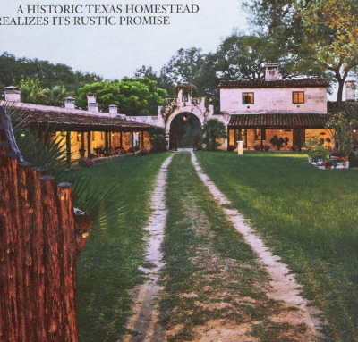
(Building) Approach
Your destination may lay be a few yards to a mile away; if you have control over that span, then you can control the pathway, or approach, to the building or interior space. In general, this pathway can be straight-on or frontal, to the side or oblique, or you can circle completely around to approach from the other side in a spiral.

The approach to the dude ranch above is frontal, through an impressive wooden gate. Visitors are clearly meant to appreciate the spread, and the owners can experience a sense of satisfaction in seeing their home in this way.
(Building) Entrances
The first impression makes the mark when meeting a future employer, friend, or house. For this reason, the entrances are just as important when designing a space as choosing inspirations or color palettes. How they look and where they're placed play a big role in determining if your entrances are effective and relate well to the rest of the project. Entrances can be flush, recessed, or projecting from the building; they can be centralized or off-set; they can take on particular geometric shapes or classical designs to reinforce ideas on the spaces to be seen beyond that entrance. Placing heavy emphasis or (opposite) de-emphasizing can call just as much attention to an entrance.

As seen, because there is a kind of structural awning over the entrance, it calls more attention to it. It's a transitional space - visitors are both indoor and outdoor while under this projection - that protects from the weather and subtly recalls kingly canopies.
Configuration of the Path
This is, or can be, very similar to spatial relationships - which it should be, considering how these concepts dovetail together. Paths can be linear, spiral, radial, grid, network, or composite.
 Remember the Hugh Newell Jacobsen structure in my last post? Here we see what a close relationship the configuration of a pathway can share with spatial organization. Its grid layout also ensures a grid pathway. The relationship won't always be this close, but it won't be terribly far off, either. For example, a clustered organization could lead to a network pathway configuration.
Path-Space Relationships
This concept differs from the above in that we consider how the path is relating to spaces very generally. As such, the path can pass by spaces, pass through a space, or terminate in a space.

The pathway above passes by most of the spaces, and then terminates (mostly) in the den. The effect is of a rather large hallway, which was the focus of the article. The spaces off to either side have reduced traffic and help maintain a semblance of privacy for their occupants, while the hallway psychologically enlarges the place overall (one might think a long hallway means a big residence or building).
Form of the Circulation Space
We take our pathways for granted; we don't always think of how our pathways are built. But they, too, need consideration. They can be entirely enclosed, open on one side, or open on both sides. (I would argue that a bridge is almost entirely open; while there may be railings on both sides, their construction is such that you can typically reach over or through those planes, and unless it is a covered bridge, there is typically no overhead enclosure either.)

A typical hallway, like the one above, is enclosed on all sides. Colonnades are examples of the other types, depending on whether or not they are situated next to another plane (wall). In a situation where there is a space within a space (such as a walled courtyard), the pathway's form would be open to one side when skirting the inner space. It could be a similar situation for a stairwell, also a space within a space, though the argument could be made that it is enclosed, instead. Regardless, the forms these pathways can take depend on various needs, such as air and traffic flow, or a need for openness or enclosure, more light or less, and where the pathways lead and terminate.
(Building) Approach
Your destination may lay be a few yards to a mile away; if you have control over that span, then you can control the pathway, or approach, to the building or interior space. In general, this pathway can be straight-on or frontal, to the side or oblique, or you can circle completely around to approach from the other side in a spiral.
 |
| Image credit: Turrentine, Jeff. "Dude Ranch Do-Over." Architectural Digest. June 2006. 206. (Overlay mine) |
(Building) Entrances
The first impression makes the mark when meeting a future employer, friend, or house. For this reason, the entrances are just as important when designing a space as choosing inspirations or color palettes. How they look and where they're placed play a big role in determining if your entrances are effective and relate well to the rest of the project. Entrances can be flush, recessed, or projecting from the building; they can be centralized or off-set; they can take on particular geometric shapes or classical designs to reinforce ideas on the spaces to be seen beyond that entrance. Placing heavy emphasis or (opposite) de-emphasizing can call just as much attention to an entrance.

 |
| Image credit: Nevins, Deborah. "Distilling the Cottage." Architectural Digest. June 2006. 224. (Overlay mine.) |
Configuration of the Path
This is, or can be, very similar to spatial relationships - which it should be, considering how these concepts dovetail together. Paths can be linear, spiral, radial, grid, network, or composite.

Path-Space Relationships
This concept differs from the above in that we consider how the path is relating to spaces very generally. As such, the path can pass by spaces, pass through a space, or terminate in a space.

 |
| Image credit: O'Keeffe, Linda and Ellen Johnson. "Hall in the Family." Metropolitan Home. April 2006. 116. (Overlay mine) |
Form of the Circulation Space
We take our pathways for granted; we don't always think of how our pathways are built. But they, too, need consideration. They can be entirely enclosed, open on one side, or open on both sides. (I would argue that a bridge is almost entirely open; while there may be railings on both sides, their construction is such that you can typically reach over or through those planes, and unless it is a covered bridge, there is typically no overhead enclosure either.)

 |
| Image credit: Thurman, Judith. "Juan Pablo Molyneaux." Architectural Digest. September 2006. 186. (Overlay mine.) |
Subscribe to:
Posts (Atom)